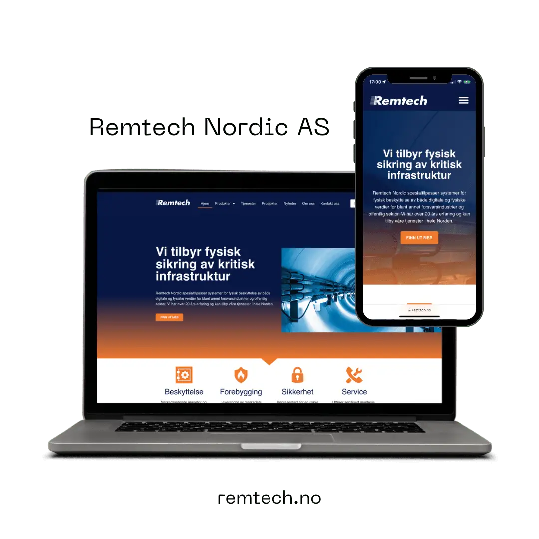
Remtech Nordic AS delivers exciting solutions and services to customer groups that would prefer not to be noticed, with good reason. In addition, the services are not as easy to illustrate with photos, which was very unusual for this image-obsessed photographer.
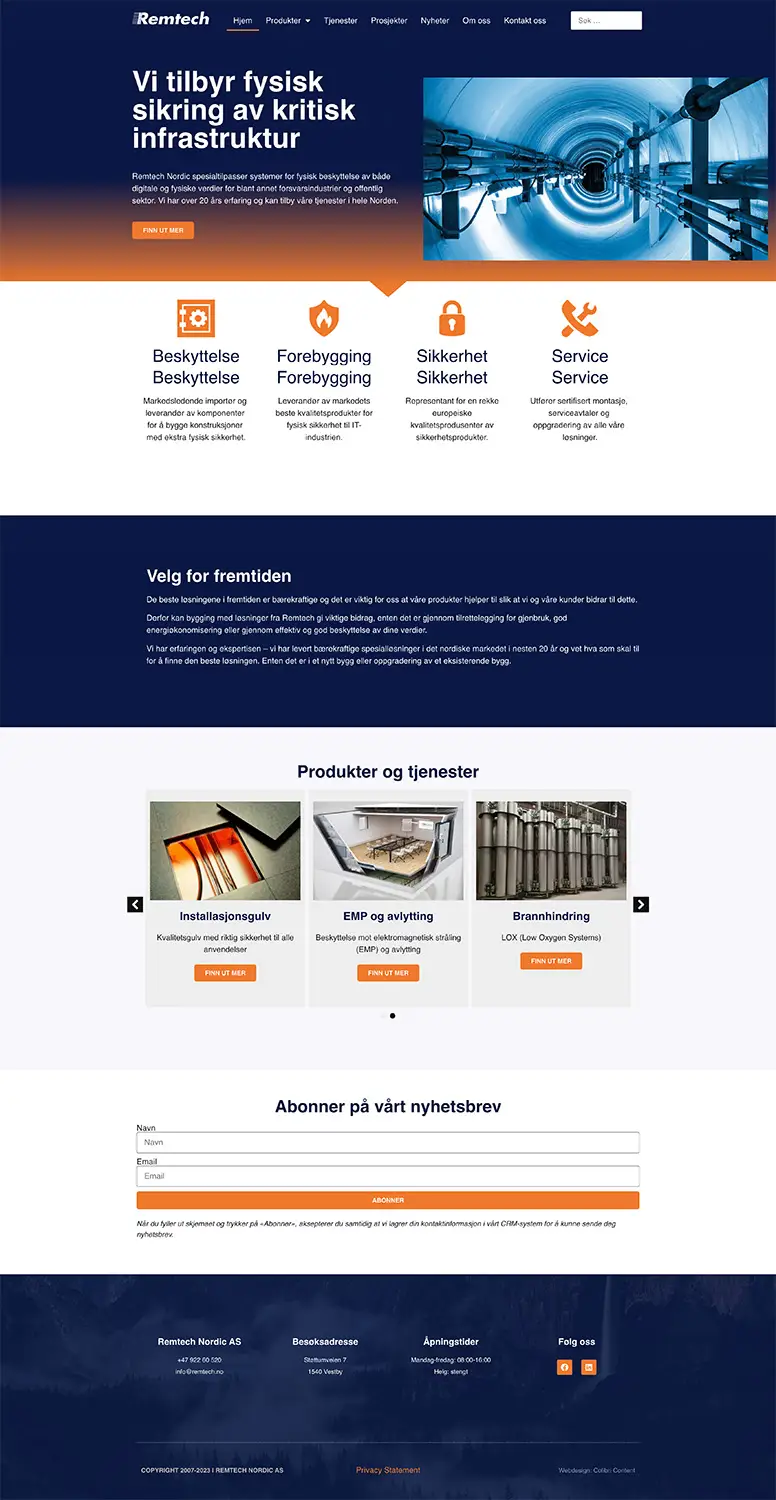
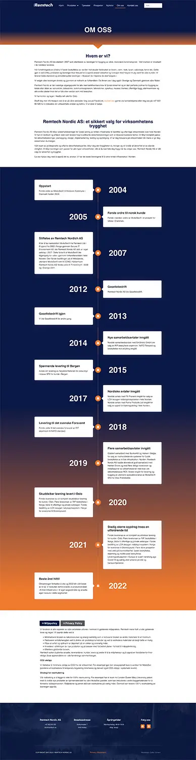
The solution was to go for a greater focus on the use of colours. The colors blue and orange had already been established on the older version of the website, and these were good branding colors that were now given their due in a new design.
Like Truls Østerud's website, I used a solution here where the products are entered and presented as if they were in an online store, with the exception that this time I built the system myself.
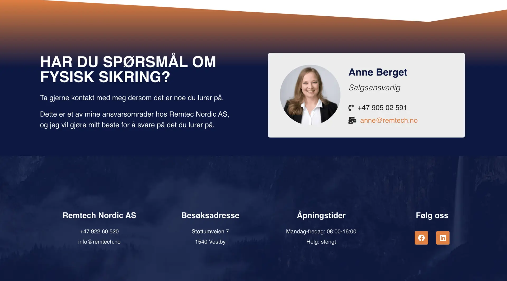
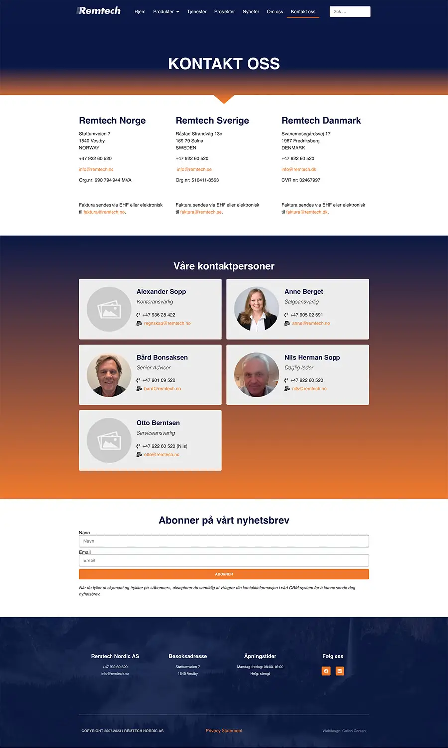
In addition, I developed a solution where each individual employee appears with their own "business card" on the product pages that correspond to their areas of responsibility.
To top it all off, all employees were photographed and the website updated with new photos.
The website was completed just before the New Year 2023.